
A small blog post with a riddle, simulation, theory and a concluding rhyme.
Consider a fictitious example in which we have collected a sample of somewhat overweight persons for which we measured weight in kg as $y$ and height in cm as $x$. We estimate the following simple linear regression:
\[y_i = \hat \beta_0 + \hat \beta_1 \cdot x_i + \hat \varepsilon\] \[y_i = 0 + 1 \cdot x_i + \hat \varepsilon\]One early message in our Economics 101 course is that for such a regression with non-experimental data, one should not interpret the estimated coefficient $\hat \beta_1$ in a causal way, by saying that one more cm height leads to one more kg weight. One should rather interpret $\hat \beta_1$ as a quantitative measure of the linear relationship between $x$ and $y$, e.g. using a formulation like:
We estimate that 1 cm higher height
corresponds on average with $\hat \beta_1 = 1$ kg higher weight.
A simulation study with an interesting finding
Let us move towards the curious feature that I promised in the title. Consider the following simple R code
set.seed(1)
n = 10000
x = rnorm(n)
eps = rnorm(n)
y = x + eps
that simulates data for a simple linear regression model
\[y_i = \beta_0 + \beta_1 x + \varepsilon\]with $\beta_0=0$ and $\beta_1=1$.
If we estimate that model, we indeed find a slope $\hat \beta_1$ close to 1 in our sample:
coef(lm(y~x))
##  (Intercept)            x
## -0.004159068  1.004741804
If for a given data set we want to assume nothing about the causal structure, we may as well estimate a simple linear regression with $x$ as the dependent variable and $y$ as the explanatory variable:
lm(x~y)
To make this blog entry a bit more interactive, I have added quiz powered by Google forms, where you can make a guess about the rough slope of the regression above.
… scroll down to continue…
Here is the result of the regression:
coef(lm(x~y))
##  (Intercept)            y
## -0.001058499  0.510719332
Interestingly, the slope is now close to $1/2$ instead of $1$! (And yes, the standard errors are very small.)
Being not a statistician by training, I must admit that I was quite surprised by this result. After all, if we would ignore the disturbances and just had a simple line $y=x$ with slope $1$, the slope stays $1$ if we just swap the sides of $x$ and $y$ to get the line $x=y$.
Of course, the observed result is fully consistent with the mathematics of the simple least squares estimator. The estimated slope of a simple linear regression of $y$ on $x$ is given by
\[\hat \beta_1 = \frac {Cov(x,y)} {Var(x)}\]Let $\hat \alpha_1$ denote the estimated slope of the regression of $x$ on $y$. We have
\[\hat \alpha_1 = \frac {Cov(y,x)} {Var(y)}\]Since the covariance is symmetric, i.e. $Cov(x,y) = Cov(y,x)$, we thus find
\[\frac{\hat \alpha_1}{\hat \beta_1} = \frac{Var(x)}{Var(y)}\]The ratio of the slopes of the two regressions is equal to the ratio of the sample variances of $x$ and $y$.
In our data generating process $y$ as the sum of $x$ and $\varepsilon$ has twice the variance than $x$, which also holds approximately for the sample variances:
c(var(x),var(y))
## [1] 1.024866 2.016225
To get more intuition, let us look at a scatter plot with y on the vertical and x on the horizontal axis. We have so far two candidate regression lines to account for the relationship between $x$ and $y$. First the red line with slope $\hat \beta_1 \approx 1$ from the regression of $y$ on $x$. Second the blue line with slope $\frac{1}{\alpha_1} \approx 2$, where $\alpha_1$ is the slope from the linear regression of $x$ on $y$.
library(ggplot2)
ggplot(mapping=aes(x=x,y=y)) +geom_point(alpha=0.2)  +
  geom_abline(slope=1, intercept=0, color="red", size=1.2)+
  geom_abline(slope=2, intercept=0, color="blue", size=1.2)+
  theme_bw()
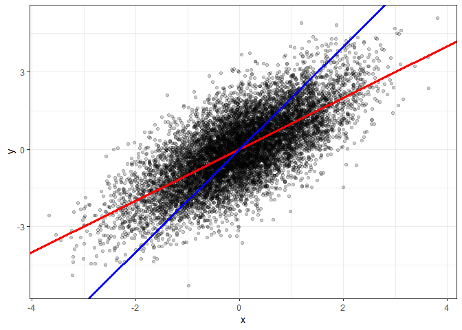
From eye-sight, I could not tell which of the two lines provides a better linear approximation of the shape of the point cloud.
While the red line minimizes the sum of squared vertical distance from the points to the line, the blue line minimizes the sum of squared horizontal distances.
So what about our interpretation of the regression slope?
So, should I present in my introductory course something like the following pair of simplified interpretations of estimated regression slopes?
We estimate that 1 cm higher height corresponds on average with $\hat \beta_1 = 1$ kg higher weight.
and
We also estimate that 1 kg higher weight corresponds on average with $\hat \alpha_1 = 0.5$ cm higher height.
Well, this seems like a good method to generate headaches, get dozens of emails that there must be a typo in my script, and to cause a significant drop of my course evaluation…
Orthogonal Regression
Instead of minimizing the vertical or horizontal residuals, one could minimize the Euclidean distance of each observation to the regression line. This is done by a so called Orthogonal Regression.
Looking up Wikipedia, we find the following formula for the slope of an orthogonal regression of $y$ on $x$:
\[\tilde \beta_1 = \frac{s_{yy}-s_{xx} + \sqrt{ (s_{yy}-s_{xx})^2 + 4 s_{xy}^2}} {2 s_{xy}}\]where $s_{xx}$ and $s_{yy}$ are the sample variances of $x$ and $y$, respectively, and $s_{xy}$ is the sample covariance.
Let $\tilde \alpha_1$ be the slope of the orthogonal regression of $x$ on $y$. One can show that both slopes indeed satisfy the relationship that we get when swapping $y$ and $x$ for a deterministic linear curve, i.e.
\[\tilde \alpha_1 = \frac{1} {\tilde \beta_1}\]We can also verify this numerically with R:
slope.oreg = function(y,x) {
  s_yy = var(y)
  s_xx = var(x)
  s_xy = cov(x,y)

  (s_yy-s_xx + sqrt( (s_yy-s_xx)^2 + 4* s_xy^2 )) / (2* s_xy)
}

beta1.oreg = slope.oreg(y,x)
alpha1.oreg = slope.oreg(x,y)

c(beta1.oreg, alpha1.oreg, 1/ beta1.oreg)
## [1] 1.5911990 0.6284569 0.6284569
The following plot shows the result orthogonal regression line through our point cloud in dark-green.
ggplot(mapping=aes(x=x,y=y)) +geom_point(alpha=0.2)  +
  geom_abline(slope=1, intercept=0, color="red", size=1.2)+
  geom_abline(slope=2, intercept=0, color="blue", size=1.2)+
  geom_abline(slope=beta1.oreg, intercept=0, color="darkgreen", size=1.2)+
  theme_bw()
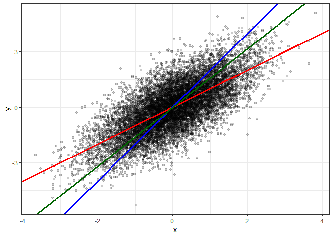
By eye-sight the green orthogonal regression line seems indeed better describe the linear relationship of the point cloud.
Conclusion?
If we just want to have a simple quantitative measure for the linear relationship between two variables, there indeed seems to be some merit for running an orthogonal regression instead of a simple linear regression.
Yet, there are many reasons to focus just on simple linear regressions. For example, it more closely relates to the estimation of causal effects and the estimation of parameters of structural models.
So maybe one should always introduce the linear regression model with all relevant assumptions and then stick to a more precise non-causal interpretation for the slope of a simple linear regression, like: “If we observe a 1 cm higher height, our best linear unbiassed prediction for the weight increases by $\hat \beta_1 = 1$ kg.” But I don’t see how that would be a good strategy for my Econ 101 course.
In the end, statistics is subtle and some simplifications in introductory classes just seem reasonable. I guess, I will just stick in my course with both: simple least squares regression and the simple interpretation.
I just will follow this advice:
Don't make you course a mess,
but just be sly,
and never simultaneously regress,
$y$ on $x$ and $x$ on $y$.
Published on 29 Oct 2018 •